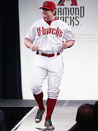
 The Diamondbacks just unveiled their new uniforms. Thank god they switched, because I am not sure if the league would have survived with only the Nationals wearing those colors. Nothing has pissed me off more than the constant altering of uniforms in sport. For some reason, every team believes that black, silver, and blue are the only colors that are going to attract consumers. The NHL even changed their classic logo to black and silver. It is not only incredibly irritating, but every team looks the same. This is most prevalent in the NHL, but is certainly not limited to it. Some classic uniforms have been ruined because some market research assistant compiled some statistical data and had some idiots fill out a survey. Have you ever wondered why the seats in Madison Square Garden are purple and aqua? Well, when they renovated it in 1991, they asked New Yorkers what the most popular colors were in an effort to enhance the color scheme. Unfortunately, the people they surveyed were wearing Skids and Hyper-color t-shirts at the time. Orange and Blue? Blue and White? No… let’s throw millions of dollars into what frigging colors are most popular while C&C Music Factory, Color Me Badd, Hi-Five, and Paula Abdul are on the billboard top ten. Just short-sighted decisions. Same thing happens with uniforms, they adjust them to raise the bottom line. Because of this some classics have been lost. I want to take a quick look at some that MUST be brought back.
-Why they are no longer red, white, and blue just boggles my mind. A no brainer in my opinion. As you know, they decided to go down the black, blue, silver, white road. Most likely because those colors have some deep roots in our nations capital.
Vancouver Canucks
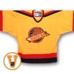
-Just a classic jersey. Why mess with that. It is such a unique color scheme that set them apart. They also adopted the new standard for uniforms.

-Just a classic jersey. Why mess with that. It is such a unique color scheme that set them apart. They also adopted the new standard for uniforms.
Houston Astros

-They have had so many different uni’s over the past 30 years it hard to figure out when they completely sold out. I always liked these though. I guess I have a soft spot for that throw-up yellow color.
Pat Patriot
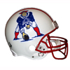 -It is extremely hard to bring this one up. The Pats have seen plenty of success under their new logo, but you can't go wrong with Pat Patriot. Love the three point stance, classic material.
 Then there are some that should be brought back for comedy sake. At the least, they would make watching games more entertaining.
Pittsburgh Pirates
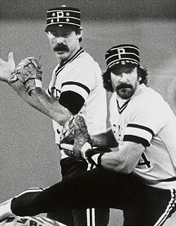 -Sorry about the black and white, but you get the picture. Although, if they brought these uniforms back, they would have to force the entire team to adopt a mustache. I can't imagine a team having this uniform and not having a phenomenal stache.
Chicago White Sox
 -You just can’t have this discussion and not incorporate these bad boys. It would not be prudent.
Hartford Whalers
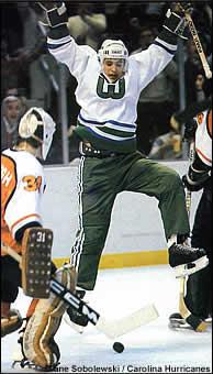 -Gotta love the Cooperalls. Here we see Ron Francis showing the full range of motion that they offer. Love the Cooperalls. Also notice the size of the goalies pads. Goalie pads were so much smaller back then. If I were a goalie today, I would sport that mask as well. I feel like that could be a good intimidation factor during shootouts.
Lastly, there are plenty of teams that, due to a number of factors, are no longer with us. These moves not only take the local team away from the community, but some great uniforms away from us. Two of my favorite hockey sweaters traveled down this road
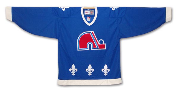
Quebec Nordiques
Winnipeg Jets

You can still get these jerseys, but it is not the same. In my opinion, you either bought yours when the team was around or you have no business wearing one. I am not a big fan of the throw back craze. As bad as I want that Canucks sweater, I will not buy one now... it wouldn't feel right. I also wish someone would burn all alternate uniforms, especially the Bruins.

No comments:
Post a Comment